

Over 70% of your potential customers are searching for your services on a smartphone while stuck in traffic on I-10 or waiting for a table in the Heights. If your website takes more than a few seconds to load, those leads have already bounced to a competitor with a faster interface. You've likely felt the frustration of a site that looks great on a laptop but falls apart on a phone. It's a common problem that leads to high bounce rates and missed opportunities for hardworking business owners across the city.
Investing in mobile-first web design Houston is no longer a luxury for 2026; it's a fundamental requirement for growth. This guide shows you how mobile-first architecture drives local visibility, boosts your Google rankings, and captures the on-the-go market. We'll break down the difference between responsive and mobile-first design while explaining how a high-performance site delivers instant results in Friendswood or Galveston. You'll learn how to turn mobile traffic into a steady stream of phone calls and new clients.
Key Takeaways
- Learn why building for the smallest screen first creates a lightweight engine that outperforms traditional responsive sites.
- Understand how mobile-first web design Houston strategies directly influence your Google rankings and site speed.
- Discover the "thumb zone" rule and how vertical-first content hierarchy keeps local users engaged on their devices.
- See the tangible difference between shrinking a heavy desktop site and engineering a mobile experience built for the local market.
- Find out how combining technical precision with creative web strategy turns mobile traffic into a consistent stream of phone calls.
What is Mobile-First Web Design for Houston Businesses?
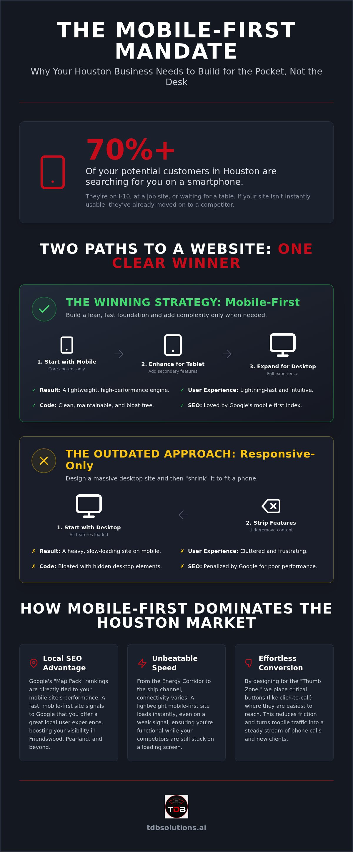
Mobile-first design isn't just a layout choice. It's a fundamental architectural shift. Most agencies design for a 27-inch monitor first. Then, they try to "shrink" that massive site to fit a pocket-sized screen. This often results in slow load times and cluttered interfaces. True mobile-first web design Houston works the opposite way. We start with the smallest screen. We code the essential content first. We ensure it's lightning-fast. Then, we add complexity only as the screen size grows. It's a "bottom-up" philosophy that prioritizes the user's immediate needs.
This approach isn't about making things fit. It's about building for the medium. In a city where time is money, your website needs to be a lightweight engine. It should deliver exactly what the user wants without the desktop "fluff" getting in the way. You don't need a heavy, image-bloated site when a customer is just trying to find your physical address or a price list while sitting in traffic.
The Core Concept: Progressive Enhancement
This method relies on a principle called progressive enhancement. You start with a solid, lean foundation. You prioritize the most critical features your customer needs. This differs from "graceful degradation," where developers build a complex site and then strip parts away for mobile users. Building from the ground up leads to cleaner, more maintainable code. It avoids the bloat often found in traditional Responsive Web Design. Your site becomes a high-performance tool. It's not a slow-moving brochure that requires a fiber connection to load properly.
Why Mobile-First is a Houston Standard in 2026
Houston moves fast. Whether your clients are in Friendswood or commuting from League City, they're searching on the go. They don't have time for a desktop-heavy site to crawl across their screen. Google completed its total shift to mobile-first indexing years ago. In 2026, if your mobile site is an afterthought, you're effectively invisible. This is especially critical for local service industries like contractors, logistics, and real estate. Customers need to find your phone number and your services instantly. They aren't sitting at desks; they're on job sites or in their trucks. A mobile-first web design Houston approach ensures you're the first business they see and the first one they can actually navigate.
Why Mobile-First Architecture Wins the Houston Market
In the Greater Houston area, speed isn't just a metric. It's a survival trait for your digital presence. When a contractor is standing on a roof in the 100-degree heat, they don't have time for a desktop-heavy site to load. They need answers now. This is where mobile-first web design Houston separates the leaders from the laggards. We build sites that function as lightweight engines. They bypass the bloat of traditional responsive sites. They deliver data instantly; even in areas with spotty coverage like parts of the Energy Corridor or the ship channel.
Houston's varied connectivity zones require a website that doesn't rely on a perfect 5G signal. A mobile-first approach ensures the core text and navigation load first. This allows users to interact with your business while the heavier visual elements catch up in the background. It's about being functional when your competitors are still "loading."
The Local SEO Advantage
Google's algorithm prioritizes the mobile experience above all else. For local businesses, this means your performance in the "Map Pack" depends heavily on how your mobile site behaves. Core Web Vitals are the yardstick Google uses to measure this. If your site is sluggish, you'll lose visibility to competitors who prioritize speed. In suburbs like Friendswood and Pearland, where local competition is fierce, a half-second delay in load time can be the difference between ranking first or falling to the second page of search results. Implementing a mobile-first design ensures your technical signals are optimized for these critical local rankings.
Conversion in the Palm of Their Hand
High rankings are useless if users can't navigate your site easily. We focus on reducing "Thumb Friction." This means designing for the way people actually hold their phones. Since 75% of mobile interactions are driven by the user's thumb, placement is everything. Our design philosophy puts click-to-call buttons and map integrations front and center. We simplify forms for users who might be on a construction site or at a busy property viewing. This reduces cognitive load. It makes the decision to contact you effortless. A custom mobile-first website doesn't just look good; it converts traffic into tangible business growth. We handle the technical heavy lifting so you can stay focused on your craft.
Mobile-First vs. Responsive Design: Clearing the Confusion
Many business owners use "responsive" and "mobile-first" as synonyms. They aren't. While both aim for multi-device compatibility, their underlying architectures are opposites. One is a compromise; the other is a strategy. Understanding this distinction is vital for any company investing in mobile-first web design Houston. It's the difference between a site that merely works on a phone and one that dominates the local market.
Responsive Design: The Old Way
Responsive design follows a "Desktop-Down" philosophy. Developers create a feature-rich desktop version first. Then, they use CSS media queries to hide or rearrange elements for smaller screens. This approach creates a "clunky" feel. Even if an element is hidden on your phone, the browser often still downloads the code and assets behind it. This is called code bloat. It wastes data. It drains the user's battery. For a Houston professional trying to view a site on a job site, this lag is unacceptable. You're forcing a mobile device to do the heavy lifting of a workstation, leading to higher bounce rates and frustrated leads.
Mobile-First: The 2026 Standard
Mobile-first design flips the script. It's "Mobile-Up." We start with the absolute essentials: the fastest load times, the most critical content, and the easiest navigation. We add high-resolution videos or complex animations only when the screen size and connection allow for it. This ensures your site is a lightweight engine from day one. It saves the user's data and preserves their battery life, which builds immediate trust with your brand. By focusing on the "thumb zone" and vertical hierarchy, we ensure the user experience is intuitive rather than adapted.
At TDB Solutions, we apply over 10 years of technical survey precision to our site architecture. We treat web development like construction intelligence. We don't just "make it fit." We engineer the foundation for performance. This leads to a higher long-term ROI. A mobile-first site is easier to maintain and faster to scale. It doesn't require a total overhaul every time a new device hits the market. You get a clean, maintainable digital asset that grows with your business. By prioritizing the user's most urgent needs first, you ensure your mobile-first web design Houston project delivers tangible results instead of just looking pretty on a laptop.
Key Elements of a High-Converting Mobile-First Website
Designing for conversion means understanding how a user moves through a site on a five-inch screen. In 2026, mobile-first web design Houston requires a strict vertical-first content hierarchy. Users expect to scroll through a narrative. They don't want to hunt for information hidden in desktop-style sidebars that don't translate to mobile. We prioritize a single-column layout that guides the eye naturally from your primary value proposition straight to your lead capture form. Micro-interactions, such as buttons that subtly pulse or change color when tapped, provide the tactile feedback mobile users expect. These small details signal that your site is modern, active, and ready to handle their request. It turns a passive visitor into an engaged lead.
Integrating High-Impact Media
Many businesses fear that heavy media will tank their load times. We solve this through technical precision. As FAA Part 107 certified specialists, we integrate high-quality drone footage and "mic'd up" business owner interviews using advanced compression and lazy-loading techniques. This allows you to showcase your construction site or real estate portfolio with professional authority without sacrificing speed. You get the visual impact of a cinematic production with the performance of a lightweight engine. We balance visual quality with technical performance to ensure your brand looks elite on any device. It's about showing your work's quality without making the user wait for a progress bar.
Navigation and User Flow
The traditional hamburger menu is no longer the only option for professional sites. It often hides the very things your customers need most behind an unnecessary click. We favor sticky CTAs and bottom-bar navigation that keeps your phone number and "Request a Quote" button within the "thumb zone." Since 75% of mobile interactions are driven by the user's thumb, placement is a matter of conversion, not just aesthetics. If your primary navigation is tucked away at the top of a large smartphone screen, you're creating physical friction for your customer. We eliminate these barriers to ensure a seamless user journey. You can explore these specific layout strategies in our Houston Web Design: Mobile-First Conversion Guide 2026.
Ready to transform your digital presence? Partner with TDB Solutions to build a site that actually works as hard as you do.
Building Your Houston Digital Identity with TDB Solutions
Choosing a web agency based in a different time zone is a risk your business shouldn't take. You need a boots-on-the-ground partner who understands the specific demands of the local market. At TDB Solutions, we don't offer generic templates or abstract promises. We deliver high-performing digital assets built on a foundation of technical precision. Our background in survey-level data accuracy informs every pixel we place. We've spent over a decade perfecting the art of data-driven results. This unique perspective allows us to bridge the gap between technical construction intelligence and creative marketing media. We understand that your website isn't just a brochure; it's a tool for growth.
The TDB Difference: Precision and Creativity
We are technicians first. Our background in technical surveying means we value accuracy over aesthetics alone. When we implement mobile-first web design Houston, we apply the same rigor we use for our aerial inspections. We don't just "design" a site; we engineer it. This ensures your custom branding reflects the hardworking values of the local community while maintaining elite performance standards. For many of our clients, this technical journey begins with our specialized work in Construction Intelligence Drone Data: The New Houston Standard for Project Oversight. We use that same level of detail when building your digital identity. No fluff. No corporate jargon. Just a site that loads instantly and drives more phone calls from mobile users.
Your Next Steps for Growth
Your current website is either an asset or a liability. If it's slow, cluttered, or difficult to use on a smartphone, it's a liability that is costing you leads every day. The first step toward transformation is a clear-eyed audit of your current mobile performance. You must identify the core "Job to be Done" for your mobile users. Are they trying to book a service? Are they reviewing your project portfolio? Once you understand their intent, you can build an experience that serves them without friction. We provide straight-talk consultations for business owners who are ready to move from being overlooked to being highly visible. We handle the technical heavy lifting so you can focus on your craft. Contact TDB Solutions today to start your mobile-first transition and secure your place in the 2026 Houston market.
Future-Proof Your Houston Business with Mobile-First Performance
Success in the 2026 Houston market requires more than just a website that "fits" on a phone. It demands a lightweight, high-performance engine designed for the palm of your customer's hand. You've seen how mobile-first architecture eliminates code bloat and prioritizes the user's most urgent needs. By focusing on speed and the "thumb zone," you turn frustrated mobile users into loyal clients. This isn't just about aesthetics. It's about local visibility and tangible growth.
At TDB Solutions, we combine 10+ years of technical survey experience with FAA Part 107 certified drone integration to build elite digital assets. We are your boots-on-the-ground partner with deep Houston local expertise. We handle the technical heavy lifting so you can stay focused on your craft. It's time to move from being overlooked to being highly visible with mobile-first web design Houston.
Get a Mobile-First Site That Actually Converts and start outperforming your competition today. Your business deserves a platform that works as hard as you do.
Frequently Asked Questions
What is the main difference between mobile-first and responsive design?
Mobile-first is an architectural strategy that begins with the smallest screen. Responsive design often builds for desktop and then hides elements to fit a phone, which creates code bloat. A mobile-first web design Houston approach uses progressive enhancement. This means we code a lightweight foundation for mobile users first. We only add complex features as the screen size increases. This keeps your site fast and efficient on every device.
Does mobile-first design look bad on a desktop computer?
Absolutely not. Mobile-first design actually results in a cleaner, more intuitive desktop experience. We use the mobile version as the core foundation and expand the layout for larger monitors. This ensures that the most important information remains front and center. You avoid the cluttered, "busy" look common in older websites. Your digital identity stays consistent and professional whether a client views it in Pearland or on a 4K office monitor.
How does mobile-first web design help my Houston SEO?
Google primarily uses the mobile version of your site for indexing and ranking. If your mobile experience is slow or clunky, your local rankings will suffer. mobile-first web design Houston focuses on Core Web Vitals like load speed and visual stability. These are critical signals for appearing in the local "Map Pack." Better performance leads to higher visibility for searches in League City and Galveston, driving more organic traffic to your business.
Can I keep my current content when switching to a mobile-first design?
You can certainly keep your existing content, but we usually recommend a strategic audit. Mobile users have different needs than desktop users. They want quick answers and easy contact options. We restructure your text and media into a vertical-first hierarchy. This ensures your most persuasive points are seen first. We trim the "fluff" that slows down mobile devices while keeping the technical data that proves your authority to Houston clients.
How long does a mobile-first website redesign usually take in Houston?
Project timelines vary based on the scope of your branding and technical requirements. A custom redesign typically moves from discovery to launch in a matter of weeks. TDB Solutions applies over 10 years of survey-level precision to project management. We set clear milestones to ensure your transition is efficient. Our goal is to get your high-performing site live so you can start capturing more mobile leads in Friendswood and beyond.
Is mobile-first design more expensive than traditional web design?
Think of mobile-first as a performance investment rather than a higher cost. Traditional designs often require expensive fixes later to meet Google's speed standards. Building for mobile from the start reduces long-term maintenance and prevents code bloat. It delivers a higher ROI by increasing your conversion rates. You get a durable digital asset that handles the heavy lifting of lead generation, allowing you to focus on your core business operations.
Why should a Houston contractor care about mobile-first design?
Most of your customers are searching for services while they're on a job site or in their trucks. They don't have time to wait for a heavy desktop site to load on a weak signal. A mobile-first site provides instant access to your phone number and project portfolio. It reduces friction for the user. If you make it easy for a busy Houston professional to contact you, you've already won half the battle.
How do you optimize drone video for a mobile-first website?
We use advanced compression techniques and lazy-loading to integrate high-impact aerial media. This ensures your drone footage only plays when the user scrolls to it. As FAA Part 107 certified specialists, we understand how to balance visual quality with technical performance. We provide the cinematic impact your brand needs without killing your site's load speed. Your real estate or construction progress stays sharp and engaging on any mobile connection.


